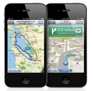
Apple Maps and the Tall Poppy Syndrome

Ever since Apple launched iOS6 with their brand new Apple Maps, the web has been flooded with reports, posts, tweets and even special tumbler blogs dedicated to pointing out how ‘catastrophically bad’ Apple’s Maps product is.

The cacophony reached a crescendo on Friday with this post from the normally respectable Business Insider, pointing out how the portion of map used for the icon for the Apple Maps app isn’t 100% cartographically accurate. The freaking icon.

Is it just me, or is this getting stupid?

Sure, it’s the first version of a product and they have some work to do. We can all point out problems and issues with it. I work for Nokia building Nokia Maps, and I know how complex a map and navigation product is. But are these kinds of relentless and ultimately pointless attacks proving anything?

My seventh grade science teacher used to call it the “Tall Poppy Syndrome”. In a field of poppy flowers, when one poppy grows taller than all the others, the other poppies do whatever they can to pull it back down again.

That’s what’s happening here. We have all sat by in wonder, awe and respect as Apple charted their amazing course to recovery to become the most valuable company on the planet. And yet now the world that rocketed Apple to success is trying to pull that poppy down again.

The mob is fickle.

The Germans have a fantastic word in their language: Schadenfreude (n). Literally translated it means the happiness you feel at experiencing the misfortune of others. There’s even an adjective form: schadenfroh.

It seems the entire tech world is enjoying seeing Apple squirm after the barrage of negative feedback and criticism over the Maps product. A whole sea of schadenfroh tech journalists, bloggers and consumers smiling to each other and insisting that they could have done better or would have advised Apple differently.

Even after Tim Cook’s public apology people were quick to point out that “Apple apologies are actually not that infrequent”, or absurdly “That would never have happened if Steve Jobs were still alive.”

Even as the iPhone5 broke all kinds of sales records at its launch last weekend, it clearly wasn’t ‘good enough’, as Wall Street was disappointed, and that makes tech bloggers sad.

It all kind of reminds me of a track from William Shatner’s classic album, Has Been. He says:

Riding on their armchairs
They dream of wealth and fame
Fear is their companion
Nintendo is their game
Never done jack and two thumbs Don
And sidekick don’t say dick
They laugh at others failures
Though they have not done shit
Beyond the flat digital map: what’s next for digital map services

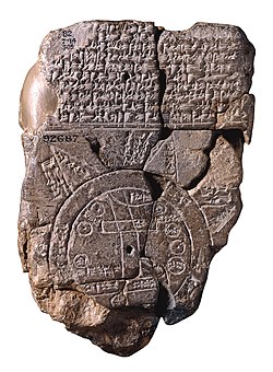
Babylonian stone map of the world.Babylonian map of the world, dated around 6BC. Source: Wikipedia
The map has come a long way since the Babylonians carved pictographic maps of their surroundings on large chunks of stone.

Ever since the appearance of the first digital maps many companies and products have appeared with the mission to produce better quality, more complete and more usable digital maps and navigation aids; among them Nokia Maps.

Since then, digital maps have become more detailed, more customisable, more accurate and more complete. Maps have become more visually engaging, with realistic 3D views of cities and countryside to add to satellite and terrain views of the world. But whatever visual abstraction, the digital maps today are still essentially a purely digital representation of their paper map ancestors: they are static. Sure, you have the ability to add different layers of information to the map or to customise the view (zoom and pan) – but these are just different ways of ‘holding’ the same map.

The vast amount of map-related innovation seen in mapping applications today in terms of the map visualisation have been in visualising data on top of the map. The very first Google Maps mash-up (Housing Maps) was a layer of real estate data on top of a plain, 2D map. Only a few products have taken visible steps to indicate a desire to innovate around how the map operates, and how a user operates with the map.

Two examples of innovation in this area are Apple, with their recently announced Map platform, and a new feature on Nokia Maps called “City Exploration”, which turns the map itself into a discovery entry point.

Apple Maps

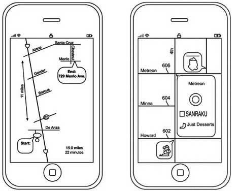
Long before Apple officially announced the new map platform they will release in iOS6 to replace the incumbent Google Maps as the default map provider it was clear they were moving in the direction of building their own map product. A couple of interesting patents, submitted last August, reveal a plan to produce what they call “schematic maps”, or what we might call a ‘back-of-a-napkin’ doodle map. They describe a map where traditional map must-haves like scale and information density take a back-seat to essential functionality: how do I get from here to point B.

It works like this: instead of producing a map that contains a completely accurate rendering of the surface of the earth, a to-scale street network and all the businesses, landmarks and whatever points of interest that might exist in a given space (the direct digital evolution of a traditional topographical map or street atlas), the “schematic map” looks more like something you would draw for a friend on the back of a beer coaster to help them get to the next pub: a simple line describing the streets and turns you will walk (most likely not to scale), maybe one or two major landmarks to help with navigation, and a big “x-marks-the-spot”.

Apple schematic maps.Apple schematic maps concept mockups. Source: Patent application.
This is a radically different approach to maps because it challenges the deep-rooted assumption that a good map is always to scale, includes as much peripheral information as possible and has a north that points to the top of the page. Here, they literally re-draw the map using a completely different abstraction; one that isn’t bound to the reality of the streets and curves of the earth.

Nokia Maps – City Exploration

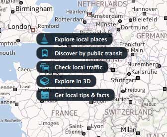
In a new feature recently released on maps.nokia.com, we make the map itself a discovery entry point by simply leveraging the existing cartographic symbols and text on the map surface as a new kind of navigational control.

We’ve learned from years of working with maps that a common use case is simple, often quite random, exploration of the world. In the same way people used to spin a globe around or flick through the pages of a world atlas to explore the cities and countries of the world, today people use digital maps to just see how the cities and countries of the world come together.

With City Exploration, you can move your mouse over any part of the map (on a country or continent zoom level) to dive right into detailed information nearly all major cities. Live traffic information, city facts, public transport information and 3D views are just some of the content that you can explore, right from the map.

City Exploration on maps.nokia.comCity Exploration on maps.nokia.com.

Now, the surface of the map starts to become the whole atlas, instead of part of the contents.

The arms race between major mapping platforms and consumer products in the past years has been largely centered around data: more, more accurate and better quality. As data becomes cheaper and more and more a commodity, the next source of differentiation will be a fundamental change in how we use and view maps. These two examples show the start of the shift, but there is much more to come.