The dinosaur might be the solution

What happens if you start building a castle and you end up with a dinosaur?
That’s ok – maybe in the end the dinosaur is the solution to your actual problem.

What happens if you build a castle, but it turns out you really needed a dinosaur? Well, then you’re in trouble.

With any creative endeavour, whether it’s a software project or something else entirely, build quickly just enough to solve your problem today. Start with the problem, break it down into smaller problems and prioritise them – then work on one problem at a time.

The thing with designing a whole castle is that it’s hard to know where to stop. How many turrets are enough? How thick should the walls be? How deep do we need the moat? Even if you can answer all of these questions today (and chances are, you can’t), the time you invest designing complex castle architecture could have been spent building the wall you really need to keep the attacking vikings out. Then during the years you spend building your mega-castle you are relatively unprotected, since the value of your castle comes when it’s complete.

Even if a whole castle is what you need now, chances are by the time you finish building the castle the world will have changed. How do you know you will still need a castle in 2 or 3 years? What if by then you need a dinosaur?

Solve today’s problem today, and save tomorrow’s problem for tomorrow. As counter-intuitive as it sounds, solving problems of the future today is very often not smart preparation, but waste.

Another reason working in silos is wasteful and inefficient

We had some tradesmen in our apartment building this week to renovate the stairwell. It was a bit depressed looking and the old carpet was a bit naff; so time for a refresh.

So the first tradesmen on the scene were the ‘stairs guys’. These guys pulled the old carpet and re-laid some new stuff, and cleaned the bits of brass that run along the edge of each step. They also re-painted the little wooden skirting boards that run along the side of the floor and each step; a nice, soothing blue. Before they painted, they went very carefully along each step and each skirting board and put masking tape on the wall above the skirting, so that their paint wouldn’t mark the walls. It’s a 5 storey building, so I’m guessing it was the better part of a day to mask it properly.

Here’s the fun part: two days after the stairs guys were gone, the ‘wall guys’ turned up to paint the walls. Before they painted, they went very carefully along the skirting boards and put masking tape along the top, to make sure they didn’t spill paint over the freshly painted skirting boards.

Painting the stairs in silos

Now, if the stairs guys had have just talked to the wall guys, the stairs guys would have realised that they don’t need to mask the wall above the skirting boards… it’s going to get painted over anyway. Could have saved themselves a day of a very dull job. But since the stairs guys are working in the stairs guys silo, and the wall guys are working in the wall guys silo, there is no communication, no information exchange and little in the way of efficiency. (And at the end of the day, we still get the bill for that day spent masking the walls.)

How often do you see this in your projects and products? How often do you see decisions made and solutions implemented that solve a problem for one link of the chain without considering the whole, end-to-end product?

The thing with working in silos is that it encourages “not my job” thinking – as in, “I could do something about this problem, but it’s not my job to fix it”. How many times do you hear a sentence like: “the testing environment is slow because we use a database server from team x and we do not have any control over it.” I hear it often… I heard exactly that sentence today.

Siloed thinking and “not my job” thinking seems to be a natural evolution of scaling up, especially when you scale quickly. Once it’s in the company culture, though, it’s hard to weed out. Better then, if you can, to catch it as it happens.

Better scrum user stories: Split stories horizontally, not vertically

Teams often run into trouble in a sprint when they’re trying to work with poorly split stories. Stories that are too big, too small, confusing or that mix the problem with the solution

We should split stories into small, discreet chunks of functionality. A single story should generally be the smallest discreet piece of functionality that adds business value. What is sometimes forgotten is that a single story should also have a complete user experience flow – it should bring the user from a determined start point to a complete, useful end.

When splitting large user stories down into smaller ones, remember to ensure the story captures a complete user flow. When splitting, think splitting horizontally, not vertically.

A horizontally split story will show a single flow, or path, through a user journey. (For example, a payment process that covers the simplest functionality, a single payment type, inability to modify your order, etc. The options are very limited, but the user is able to reach a useful end – ie, they can pay for something.)

A vertically split story will show multiple paths through a flow, but will stop before the flow can reach a useful end. (For example, a payment process that covers, at once, all the different payment methods that you ultimately want to support, but not the surrounding user flow.)

The problem with splitting vertically instead of horizontally is that vertical ‘strips’ have the entire complexity of the full, complete solution, but you lose the ability to test the whole flow properly. It is also far more tempting to dive into a pie-in-the-sky architecture discussion because to build all the full options for this one strip requires an understanding of all the inputs and outputs of the flow – most of which probably don’t exist yet.

An incomplete flow not only adds no user or business value to your product, but it’s very difficult for teams to build effective solutions for incomplete flows. Think and split in terms of thin, horizontal flows, and increase complexity with additional horizontal ‘layers’ (additional stories).

Get it over with

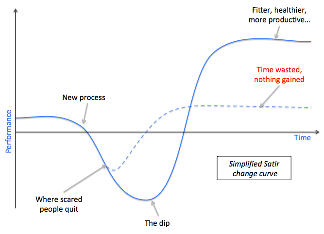
I recently wrote about the Satir change curve, which is a model for describing the impact of new processes on the performance/velocity of a team or organisation. In short, your velocity is going to go down before it goes up.

Understanding this curve, and having the courage to stick it out, is the key to driving new processes through in your team… but when you know the dip is coming, it’s tempting to put off implementation until “the right time”.

The problem is of course that there is never a “right time”. The perfect time for your performance to dip will never come along. Ever. There will always be another looming deadline, another bug to fix, another conference, another angry VP and another reason to put off getting better.

So just get started. Change something – today. Right now. Not only is another day of procrastination and fear just delaying the pain, but it’s also costing you and your team the extra performance that they could be profiting from in a month from now.

And when you’re done – change something else.

Stick it out

You can’t change your shoes while you’re running.

Have you ever heard the expression “it’s gonna get worse before it gets better?” If you’re talking about improving processes or ways of working in your organisation, then chances are this expression’s probably true. Any new process or change in ways of working has a wearing in period, during which time it’s easy to lose faith in the new process, or misinterpret temporarily reduced velocity as a failure of the new process.

My colleague Simon recently introduced me to the Virginia Satir change curve. You can read a good explanation here but the basic premise in our context is that after any new process or change to the status quo is introduced, your productivity will at first go down, not up, while everyone gets used to the new process and while people make mistakes and learn how to deal with the new system.

Simplified Satir change curve

The best planned change management actions always result in a drop in productivity before benefits are seen. Often, people either misinterpret reduced performance as a failure of the new process, or they get scared waiting for the dip to come. The trick, then, is to not only predict this period of reduced productivity, but embrace it. Discuss it, learn from it and accept it as a normal part of healthy change. Most importantly, though: stick it out.

You can’t change shoes while you’re running – you have to slow down; even stop. But once you’ve got your new shoes on, you’ll run faster. If you’re running a 100m sprint, maybe it’s not worth it. But how many software products reach the finish line after a few seconds, days or even months?

Copywriting is interface design

Your product’s user interface is its window to the world. It’s how your users interact with you, and how you interact with your users. The words on your interface are central to the user experience, and crafting perfect copy is every bit ‘User Experience Design’ as designing the user flows, choosing colours and designing screen elements. Why, then, is copywriting so often left until the very end, done in a rush or, even worse, not really thought about at all?

Every word on the screen matters, as much as every button or every pixel. A great product can be made unusable if the copy is bad (or if the translation is bad, for that matter, but that’s the topic of a whole other post).

A few other things I’ve learned about copywriting from working on maps.ovi.com:

  • Hire a copywriter. A good one.
  • The copywriter should be a part of the design process. They should know the product design as well as the Product Manager or the UX designers. They should speak and breathe ‘web’ (or whatever product/industry).
  • There are different kinds of copy, and they each require a different approach and different skills. Product interface is different from product marketing copy, help copy, communications copy, social media posts, etc. It’s not necessarily the case that one person can’t write many different styles of copy, but you should know what kind you are writing.
  • It feels dumb even writing this, but here goes anyway: No spelling or grammar errors, please! Obvious spelling errors take a massive chunk out of your credibility. Yes, if you’re writing a blog it probably doesn’t matter so much, and the Internet is changing the way we write and communicate in the English language anyway, but still: would you think twice about giving your credit card details over to a site with a misspelling in the payments screen? I certainly would…
  • Don’t let non-native English speakers write the final English copy. I’m real sorry, but unless you’ve been living in an English-speaking country for 20 years, we can tell that it’s not your first language. That’s ok! But I wouldn’t trust myself to write the final German copy for my product either.
  • Don’t use technical jargon or internal codenames for things in your interface. For example, while we were working on bringing positioning to maps.ovi.com (the ability to see your own position on the map via your wifi) we called the feature ‘WiFi positioning’. Before long, the term WiFi positioning made it into our interface copy. The problem? A user would have no hope of knowing what WiFi means, what it does, etc. Keep technical jargon out of your interface.
  • Be consistent with yourself: if you call the button ‘Continue’ on this screen, don’t call it ‘Next’ or something else on the next screen. Users associate behaviours with patterns, and they learn to predict the functionality on new screens based on their experience with previous ones.
  • Be consistent with the industry: if every other product in your category calls a spade a spade, and you want to call it a shovel, you’d better have a good reason. Users also look for patterns across products and norms aid their learning curve. If you throw new terminology at new users, it makes it just that little bit harder to pick up and learn. A good example: think about the last time you installed a new program on your PC. Did you read any of the text during the installation process? Probably not, right? Because most installers follow the same process, have the buttons in the same place and so on, you know how it works and you don’t need to learn it each time. (Okay, now we’re talking more about interaction design, but you get my point…)
  • Be clear and concise: copy should be exactly as long as it needs to be, and not longer. Consider every sentence: can it be shorter without impacting the meaning or ease of understanding? If yes, then cut it.
  • Keep it to a minimum: it’s hard to read long chunks of text on the screen. In fact, most people will look at a long chunk and probably won’t read it at all. Keep lots of white space around your text to aid reading.
  • Talk about benefits, not features. “Syncronise your favourites with your phone!” Huh? Why do I want to do that? “Favourite places you add are kept in sync with your phone, so you can access them when you’re on the go!” Ahh, now I get it.
  • Consider Search Engines (SEO) where appropriate.

A good copywriting resource is Copyblogger.

Copywriting shouldn’t be an afterthought… build it in from day one.

Don’t be evil (product designers)

Today, for the first time in what seems like ages, my PC caught the flu. This time it was a particularly annoying piece of malware called HDD Low; one of those fake system config utilities that spams you with fake warnings about your hard drive or memory until you give in and buy their special ‘system optimiser’ software that removes the alerts.

I Googled for some assistance, and ended up on a website for a product called Trojan Killer. This site is clean and well laid out and free of advertising. It offers detailed information about the virus and some instructions on how to remove it. It offers two options: instructions to remove it manually, or a free trial version of their Trojan Killer software.

Let’s examine the scenario so far: a clean and modern looking website with no advertising builds trust in the site and in the company (normally ‘bad’ sites have lots of ads and just look unprofessional). The transparency of offering manual removal steps as well as the software install further builds trust (they don’t need me to download their software, so I assume the software is ‘clean’.) I am now at the point where I trust them enough to download and install their software.

I downloaded and installed the free Trojan Killer app, and after a normal install process the app fired up and started an initial scan. After about 30 minutes of scanning it not surprisingly found our friend HDD Low and also a couple of other little things. It presented me a list of 10 or so infected files, with a big red button to ‘Clean infections’. I clicked it…

… and was hit with the credit card details page. SNAP! Now, after 45 minutes of trying to remove this virus, I have two choices: cough up and pay money to buy this app, or go back to the drawing board.

This is a very ‘good’ example of consciously evil product design. The flow from discovery to installation of the software is designed to build your trust with transparancy and professionalism to encourage you to download the ‘free trial’ version which is not really free at all. It tricks you into investing your time letting it scan your computer and then it makes you nervous about the viruses and ‘suspicious’ software it finds. But a solution is only one click away! The ‘remove’ button is even there, ready to be clicked – but first, you just need to enter your credit card details…

Their methodology is simple:

Trust + Nervousness + Time investment = (evil) sale

For me, at least, tricks like this don’t work: I trust this application and this company far less now, and I am far less inclined to hand my credit card details over to them – but I have to wonder how many people fall into this trap.

Treat your customers fairly. Don’t use false offers to trick them into downloading your software. Be honest about what your ‘free trial’ does: if it has the capability to scan the computer but not remove the errors, that’s fine, but tell the customer before they download it. Sure, you might make a few sales with scams like these; but how many of those sales are likely to grow into valuable, long-term relationships?

Being open and honest will always pay off in the long run.

(By the way, I managed to remove HDD Low without installing anything (else). Instructions are here.)

How to remove HDD Low malware without paying for Anti-Spyware software or installing anything

For the first time in what seems like ages I somehow managed to catch a virus… this time a very annoying one called HDD Low. It’s one of those fake system optimisation utilities that keeps spamming you with false alerts about your system (low memory, hard drive error, etc) until you give in and buy their fake ‘repair’ software to fix the problem. This one was even almost convincing… the first screen had me almost convinced it was a genuine Windows alert.

The good news is that it’s pretty easy to get rid of, and you don’t have to install any extra anti-spyware software or pay anyone anything. Here’s what you need to do:

1. Press Control-Alt-Delete to get to your Task Manager. Open it up and kill the HDD Low processes. They won’t be labelled ‘HDD Low’ – they will be labelled with a random string of letters and numbers. If you’re not sure, just kill any processes that look suspicious. I found that one of the HDD Low processes kept re-opening itself directly after I killed it – but if you kill it again as soon as it pops back into the process list, it is gone for good.

a) If Task Manager isn’t visible in the list when you press Control-Alt-Delete, try restarting your computer. HDD Low will start again automatically, but Task Manager should be visible now.

2. That should have taken care of the pop-up messages that keep annoying you. If you are still seeing pop-up messages, or if the HDD Low Icon is still visible in the task bar, then the processes aren’t dead yet… go back to Task Manager and try again.

Now you need to remove the registry entries to stop it coming back again. Go to Start –> Run, and type regedit. You’re now looking at the registry editor. Be careful! If you remove the wrong registry keys from here your programs or Windows may stop working. Navigate using the tree to the Run folder: HKCUSoftwareMicrosoftWindowsCurrentVersionRun

This folder specifies what should run when windows starts. There will be (at least) two registry keys that look like random numbers, and the entry in the ‘value’ column will link back to a folder in your User Data’s temporary folder (something like: C:UsersYour_UsernameAppDataLocalTemp47456096.exe). Delete these registry keys.

3. The hard part’s done. Now you just need to clean up the files HDD Low leaves lying around. First remove the application files from your Temp directory: C:UsersYour_UsernameAppDataLocalTemp47456096.exe. Again, the file will be a random string of numbers or letters. Remove anything that looks suspicious. Then remove the Application shortcut from your desktop, and you’re done!

I hope this helped!

Analytics, data and product innovation

It’s important to understand what your users do, how they use your product… but remember: data never paints the whole picture. User research, user testing, usability studies, behavioural analysis, usage statistice: it’s all important – understanding and making sense of this data is crucial for your product’s development – but this data doesn’t exist in a vacuum, and it’s not enough to (alone) drive a product.

An example: The first iMac was released in 1998 and apart from looking really funny it was the first personal computer sold by default without a floppy disk drive. There wasn’t even a place to build one in… you had to buy an external one and connect it with a usb cable. It caused an uproar – analysts and journalists called them crazy – you can’t ship a computer without a floppy disk drive!

When was the last time you even saw a floppy disk?

If apple had have run a survey with all their customers before releasing the iMac and asked the question: “would you expect a new computer to have a floppy disk drive?”, I’ll bet most of their respondants would have said ‘yes’. But product and market innovation doesn’t happen through user surveys or focus groups, and it doesn’t happen through analytics… It comes from visionaries who challenge expectations.

I had a similar conversation with a colleague recently as we were discussing including a new feature in maps.ovi.com. A couple of days after the discussion he came back to me and said: “we checked the application logs and site analytics, and we see very few instances of user behaviour that indicates that people want that feature, so we conclude that it’s a not feature that people want.”

Well of course there are not many instances of this behaviour in the logs. If your product interface doesn’t support a particular functionality (that is, if you don’t tell your users about it), how should they know to try it? And if someone did think to try it, and it doesn’t work, how many times would they try before they gave up?

User analytics is extremely important for optimisation and product evolution, but don’t confuse optimisation with innovation. Innovation is something else. Innovation challenges the analytics; it challenges the market, it challenges expectations and it challenges users themselves.

Do you innovate or optimise? To be remarkable, I think you need to do both.

Better scrum user stories: save the solution for the spec

In the world of Scrum the user stories are at the heart of everything that’s added to the software: it’s how you break down the product strategy and requirements into discreet, develop-able chunks. We build software for our users, so it makes sense that everything that’s added to or taken away from the software is expressed in terms of a user need.

The Scrum textbook recommends the following standard form for a user story:

– As a user, I want to do {thing} so that I {reason}.

The trick is to focus the story on what the user really wants, not how you plan to solve that need. You need to keep the solution out of the story.

A couple of examples:

“As a user, I want to see my favourite places in a list so that I can find the one I am looking for.”

What’s wrong with this story? It is not a story about a user need; it is a specification for a solution. Does a user really want to see their favourite places in a list? Or do they just want to see their favourites? Is a list the only way to solve this need?

How about: “As a user, I want to find the favourite place that I’m looking for, so I can see information about it.”

Another example:

“As a user, I want to see Public Transport lines on the map.”

Do they? Or do they want to know where Public Transport lines run? Is putting them on the map the only way to do that?

How about: “As a user, I want to understand where Public Transport stops are in my city, so I know where to go to get the next train.”

Why is it important to keep the solution out of the story?

The User story represents the problem that the user wants to solve, to which you and your team need to find a solution. The steps to finding a solution are understanding the problem, brainstorming/investigating possible solutions, possibly in conjunction with benchmarking of competitor products and user research, then selecting a solution and specifying how that solution will work. When the solution is already embedded in the story, you spring over the first two steps, which not only means that you’re not looking at the problem broadly enough, and you will potentially miss good, new or innovative ways to solve the problem, but you’ll have no data to justify that the solution you chose was better than any other.

Write stories that focus on needs, and save the solution for the specification.