The users lose

When the giants of the tech world play the game of thrones, it’s the users who pay the blood price.

About two weeks ago Twitter removed the Instagram inline preview of Instagram photos, meaning Twitter users can no longer see Instagram photos their friends have posted directly in the twitter stream: users now need to click the Instagram link, and open the Instagram site in another browser tab to view the photo.

Why? Due to hostilities between Twitter and the now Facebook-owned Instagram that can most likely be traced back to bad vibes stemming from some sneaky dealings during the company’s acquisition.

This is just the latest example of the user’s experience suffering as successful and loved products start to feel the investors’ pressure to focus on monetisation and revenue. LinkedIn users felt a similar blow when tweets stopped appearing on people’s user profiles as Twitter tightened up access to the API back in June.

The very open philosophy of APIs and data exchange that helped to build companies like Twitter is slowly getting left by the wayside in the search for sustainable monetisation strategies for “Web 2.0” products.

Where does this leave users?

Application experiences are increasingly taking place behind walled gardens – meaning that all, of the majority, of user’s interaction with the service is taking place within the proprietary application interfaces (twitter.com and the official twitter apps, in Twitter’s case, for example). This will lead to less choice and fewer options for users in terms of where and how to consume content and interact with the service.

Moreover, the products and services created by 3rd party developers leveraging APIs such as twitters have heavily driven innovation in the core products and the surrounding ecosystems.

When the first web mashup was born seven and a half years ago when Paul Rademacher reverse-engineered Google Maps to put craigslist rentals on a map it set a precedent that influenced, maybe more than anything else, how the web would develop for the following years. The social web as we know it today, led heavily by product companies such as Twitter, Facebook, Tubmlr, Foursquare, WordPress and many others have been built on a philosophy of openness, hacking and mashing up diverse data assets into new and compelling experiences.

As more and more of the power on the web is drifting toward more closed and walled-up product ecosystems like Facebook, Google+ and others, we need to call on these companies to remember the philosophy of openness that built the web that allowed them to succeed. Data should be becoming more, not less, available and sharable, and the pillars of the modern social web are in the position now to set the precedent for the next 7 years of innovation on the social web.
Apple Maps and the Tall Poppy Syndrome

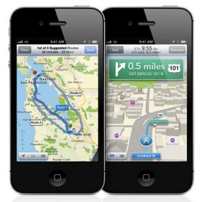
Ever since Apple launched iOS6 with their brand new Apple Maps, the web has been flooded with reports, posts, tweets and even special tumbler blogs dedicated to pointing out how ‘catastrophically bad’ Apple’s Maps product is.

The cacophony reached a crescendo on Friday with this post from the normally respectable Business Insider, pointing out how the portion of map used for the icon for the Apple Maps app isn’t 100% cartographically accurate. The freaking icon.

Is it just me, or is this getting stupid?

Sure, it’s the first version of a product and they have some work to do. We can all point out problems and issues with it. I work for Nokia building Nokia Maps, and I know how complex a map and navigation product is. But are these kinds of relentless and ultimately pointless attacks proving anything?

My seventh grade science teacher used to call it the “Tall Poppy Syndrome”. In a field of poppy flowers, when one poppy grows taller than all the others, the other poppies do whatever they can to pull it back down again.

That’s what’s happening here. We have all sat by in wonder, awe and respect as Apple charted their amazing course to recovery to become the most valuable company on the planet. And yet now the world that rocketed Apple to success is trying to pull that poppy down again.

The mob is fickle.

The Germans have a fantastic word in their language: Schadenfreude (n). Literally translated it means the happiness you feel at experiencing the misfortune of others. There’s even an adjective form: schadenfroh.

It seems the entire tech world is enjoying seeing Apple squirm after the barrage of negative feedback and criticism over the Maps product. A whole sea of schadenfroh tech journalists, bloggers and consumers smiling to each other and insisting that they could have done better or would have advised Apple differently.

Even after Tim Cook’s public apology people were quick to point out that “Apple apologies are actually not that infrequent”, or absurdly “That would never have happened if Steve Jobs were still alive.”

Even as the iPhone5 broke all kinds of sales records at its launch last weekend, it clearly wasn’t ‘good enough’, as Wall Street was disappointed, and that makes tech bloggers sad.

It all kind of reminds me of a track from William Shatner’s classic album, Has Been. He says:

Riding on their armchairs
They dream of wealth and fame
Fear is their companion
Nintendo is their game
Never done jack and two thumbs Don
And sidekick don’t say dick
They laugh at others failures
Though they have not done shit

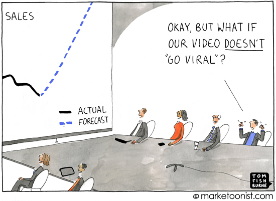
5 viral product marketing myths


“Go Viral” by Tom Fishburne.

Everybody’s saying it…

“Let’s make it go viral!”

“We need to build in some virality.”

“It should be more viral!”

The problem I have encountered often recently is that many people seem to have various misconceptions about what ‘viral’ really is, what it really means – but mostly how easy (read: difficult) it is.

I hit the web and spoke to some friends and colleagues in the industry and uncovered quite a few myths and legends concerning viral products and viral marketing. Here are a few virality mythbusters for the next time someone turns up at your door asking you to “just make your product go viral”.

MYTH:
Virality is only including the ability to share stuff to social networks from within your product.

BUSTED:

The ability to share content to social networks from within applications is just expected functionality these days. True and proper “virality” for social apps is not just letting your users share objects out of your product (although it helps).

Apps that successfully use a viral engine of growth build the core interactions around the need or desire to involve your friends in the product experience. In other words, it’s not about broadcasting your status to your friends: it’s about using the product together with your friends. Some classic examples of apps that have gotten this nailed are Words with Friends or Farmville.

MYTH:
Virality is automatically posting everything that happens within an app to the user’s facebook wall or twitter feed.

BUSTED:

No, this is just annoying. If the Facebook news feed logic doesn’t start blocking your updates, your user’s friends certainly will. Sure, some early products made it big by spamming their user’s facebook feeds, but this just doesn’t work anymore.

MYTH:
A clever, witty and funny message (ideally with a kitten) will automatically “go viral”.

BUSTED:

The reality is that most attempts to create something witty with the specific intention of making it “go viral” will fall flat. People are smarter than that, and they know when someone’s trying to play them.

A notable example is when Ashanti thought it would be a neat idea to support her new album by creating a viral campaign that let people send their friends death threats. No further comment necessary!

“Making it go viral” should not be the goal. Viral is the outcome of a great piece of content that successfully engages users.

MYTH:
Sharing the first link on your facebook wall and Twitter feed is enough to start the avalanche.

BUSTED:

Nope. Viral messages need to be seeded properly. It’s all about momentum. If it takes too long to get started, it will die out before it reaches its peak. Properly seeded viral messages start by getting spread by people with many thousands of followers… not the 250 people on your personal twitter post.

Serious marketers also pay big dollars to seed messages. In fact, social media agencies measure return on investment (ROI) on social campaigns by how many views a message gets relative to how much cash they spend to seed it.

Now, don’t get me wrong: clearly when you an everyone in your team tweet and post and blog about your product or message, it can only help. In fact, I view it as a very important activity for the whole team to be a part of… but the point is, it’s (probably) not going to result in a million views overnight.

MYTH:
If we make a product video and upload it to YouTube, our marketing work is done… YouTube will do the rest.

BUSTED:

Over 72 hours of video are uploaded to YouTube every minute. Yes, every minute. However, some research has indicated that less than 1% of videos get more than 5,000 views in a year. YouTube is a crowded, cluttered space, and not every video is going to stand out, and you’re going to need to do a little more than just upload it to YouTube and hope for the best.

Here’s an example: the official Nokia YouTube channel has, at the time of writing, 635 videos uploaded. Of that, only 22 videos (3.5%) have more than 1 million views, and only two videos have more than 5 million. And of those 22 with more than a million views, only five videos are less than 12 months old.

Compare that with some classic examples of viral successes, such as this Evian commercial, which has over 58 million views.

Clearly, a lot of varied content helps raise the overall number of views (109 million aggregated views for the whole Nokia channel), this total is not the result of one silver bullet-style viral video, and it wasn’t achieved overnight.

Social media is a powerful set of tools to allow you to reach unprecedented numbers of people. But if your message is not compelling and engaging, then people won’t engage with your message. Just like the fascination (and the birth and massive growth of an entire industry) surrounding Search Engine Optimisation (SEO), you can try to play the system, but at the end of the day if your content is not compelling, the tricks won’t help you… at least not long-term.

People share content that they care about and that is meaningful for them. Something “going viral” is the result; it should not be the goal.

Dear NULL

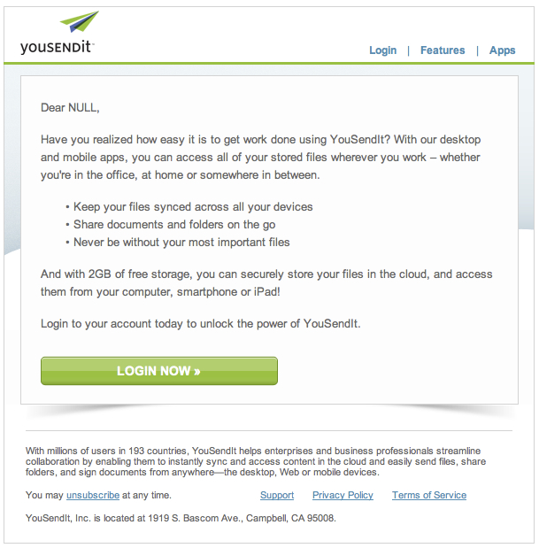
You Send It - Fail
It’s a simple thing to get someone’s name right.

Yousendit had an opportunity. They had my email address from whenever I had signed up to their service in order to download some file or another. I knew the service and trusted it enough to sign up, and if I had left my email address, I had surely left my name as well.

Since then I obviously haven’t been back, but they had the opportunity to send me a single, polite, targeted email message to remind me of the service, let me know what’s been happening, and maybe convinve me to come back, check it out and perhaps even start using it again.

And yet the first line of the email: “Dear NULL”.

As someone whose name people often get confused (I get called “Gil” a lot. Evidently it’s quite a popular French name here in Europe), I know how not-nice it is to be addressed with a name that’s not your own; especially by people who are supposed to know you.

Each opportunity to have to have a meaningful conversation with a user is a gift. It’s a unique chance to build a valuable relationship with someone who will use your products or services and tell others about their great experience.

Attention is more and more expensive and more and more rare, so when you manage to get the attention of your users, even for a moment, use it wisely – don’t squander it.

And you can start by getting their name right.

You Send It - Fail

Seeing the future

I found a great quote from the book Meta Products (Rubino, et al) on what makes future thinkers and innovators good at innovating, and I just had to share it:

“We’ve studied the ideas of some of the well-known futurologists and innovators such as Juan Enriquez, Steward Brand and Katherine Fulton among many others, and we can identify a similarity between them that perhaps can explain why they are so good at looking at the future: they are genuinely interested in ‘change’ and in understanding why we change. They keep abreast of scientific discoveries and research challenges. They are very interested in linking the past to our present and intuitively reflecting on the future. There are characteristics in the attitudes of the great futurologists and innovators that cause them to be constantly dissatisfied with the ordinary, forcing them to look for controversy and confrontation wherever they are. It’s not that they are difficult people, it’s probably just their way of identifying the real motivators for doing what we do, and why we change. Futurologists and innovators also love serendipity — when you find something you weren’t expecting to find, or when you have the ability to link together apparently unrelated facts to create unexpected and valuable new information.”

In other words, the ability to “predict” the future is linked heavily to one’s ability to see and understand not only the past, but how our aspirations and motivations as humans cause us, and with us our society, to change. Change is the greatest opportunity for new innovations and new business models, and understanding the human aspirations behind change can help us see what is coming. So, a student of human aspiration is in a unique position to understand the evolution of human wants and needs.

The book is an incredibly interesting exploration in product design in the fully connected world: the so-called “Internet of Things”. How should we as designers and creators of products enable fully connected experiences through our products and services?

You can read the whole book online for free here, or you can buy the print version from Amazon here.

Attention to detail

The Simpsons: Homer and Scorpio

Homer: It’s nothing big; it’s just a lot of little things.
Scorpio: Homer, you can’t argue with the little things. It’s the little things that make up life.

In the biography written by Walter Isacsson, Steve Jobs recalls watching his father paint the posts for the picket fence in the yard of their Cupertino home in the 60’s. A young Jobs asked his father why he was painting the back of the posts as well as the front, even though nobody could see the back of the posts. His father replied: “because I know they’re there”.

This is attention to detail.

The little details count, and more than you probably think. Whether spelling or grammar; visual consistency or alignment; order or neatness: paying attention to the finer presentation details makes an important difference to your message. It doesn’t matter if it’s a visual interface within a product, an instruction manual, a marketing message, a powerpoint slide or a simple email: the principle is the same.

It’s not just about having a powerpoint slide with consistent punctuation… and it’s not about perfectly painted fence posts. It’s an attitude that you carry with you everywhere; that’s part of everything you do.

Some general tips:

  • If you have three paragraphs on a slide or page, and the first three have a fullstop and the last one doesn’t… fix it. Don’t use 5 different font sizes on the same slide.
  • If you’re writing code, take care to follow the coding guidelines. Document. Clean up after yourself. Keep it tidy.
  • Grammar, spelling, etc matter… whether in an email or in interface copy. Take care. Use a spell-checker. If you’re not a native speaker of the language you’re writing in, have someone proof-read it for you if it is something that will be seen by a lot of people.

Good Design is…

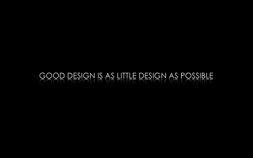
Good Design - Dieter Rams - small poster

In the 1970’s renowned German designer Dieter Rams defined ten design principles that embodied his view of design and product development.

He said:

  1. Good design should be innovative.
  2. Good design makes a product useable.
  3. Good design is aesthetic design.
  4. Good design makes a product understandable.
  5. Good design is honest.
  6. Good design is unobtrusive.
  7. Good design is long-lasting.
  8. Good design is consistent in every detail.
  9. Good design is environmentally friendly.
  10. Good design is as little design as possible.

Timeless.


(The translation is mine from the original German, but I’m sure there are countless others, including on wikipedia.)

Original German version:

  1. Gutes design sollte innovativ sein.
  2. Gutes design macht ein Produkt brauchbar.
  3. Gutes design ist ästhetisches Design.
  4. Gutes design macht ein Product verständlich.
  5. Gutes design ist ehrlich.
  6. Gutes design ist unaufdringlich.
  7. Gutes design ist langlebend.
  8. Gutes design ist konsequent, bis ins letzte Detail.
  9. Gutes design ist umweltfreundlich.
  10. Gutes design ist so wenig design wie möglich.

You can download the image above as a desktop wallpaper in English or the orignal German.

Consistency is not a rubber stamp

Consistency - a row of blue and orange map pins

Stop signs are always red. Exit signs are green. Play buttons are triangles. These are patterns and norms that, when appropriately leveraged in a design, can help communicate expectations and function. It doesn’t matter if you are an interface designer working on a software UI, a software engineer writing code or a manger preparing a powerpoint presentation: consistency is important.

What consistency is not, however, is copy + paste. As a great designer on the maps.nokia.com team said in a design review recently: “Consistency is not a rubber stamp.” It’s not a cookie cutter. It is a careful and thoughtful association between what you are doing and the user’s current knowledge. In other words, the question to ask is: “will this design allow my user understand what they need to do or what I am trying to communicate to them, given their experience, knowledge and understanding?” Two elements of a system can be consistent with each other without being the same.

Consistency for consistency’s sake (or, on other words, forcing total consistency at the expense of function) is a design crime of an similar magnitude.

Rather than asking the question: “is this consistent?” – ask the question: “will my user/reader/audience/etc easily understand, given their context and knowledge?”

As Emerson famously pointed out:

“A foolish consistency is the hobgoblin of little minds, adored by little statesmen and philosophers and divines. With consistency a great soul has simply nothing to do.”

Where Conference 2012 – Highlights

The Valley’s preeminent conference for Location-based services, Where (formerly Where 2.0), was on again at the start of April in San Francisco. The usual suspects were in attendance, with the likes of Google, ESRI, MapQuest and Foursquare holding prominent positions on the exhibition floor and presenting several keynotes. I was there of course with Nokia Location & Commerce, representing our Where Platform and location applications portfolio and our flagship product Nokia Maps.

Many of the themes of the presentations were covering similar material, I noticed a few main themes coming out of the presentations in general.

Open Street Maps and other alternatives to Google Maps

A common discussion was around the alternatives to the Google Maps API as a location platform for online and mobile applications. There has been lots of talk recently about Google’s decision to charge services for extensive usage of the location API, and many organisations are searching for an alternative. Open Street Maps, although not present at the conference themselves, were talked of often as “the” alternative to Google Maps. Although many other paid and free alternatives exist, including Nokia’s Nokia Maps API, OSM seemed to be by far the most talked about.

Custom Maps and open map data

A trend is emerging around creating custom maps. Products like Mapbox are providing products that let you literally build your own map. Using Open Street Maps data, Mapbox lets you design/customise everything about the map design: labels, colours, catographic elements, zoom levels and everything else. They then not only provide the completed map, but even make it into tiles and host them.

The takeaway is that there is a trend emerging whereby people and organisations are placing much more value on the map design itself in terms of building or customising a product or service. Even as we see visual developments in the map design and style of the major map platform providers (like the recent visual updates on the Nokia Maps map style), we’ll see in the future countless different map styles and designs; customised both for differentiated visual appeal and also for the product or service’s specific use case.

Layers are dead

After the very first Google Maps “mash-up” emerged location-based services focused heavily on placing data on a map. Whatever data you had, if it had a location, you could suddenly turn it into a layer on a map. Most experiences visualised all the location data as “pins” on the map layer. Other visual techniques emerged such as heatmaps or clusters, but essentially it was just like it’s real-world equivalent: a collection of pins on a map.

What is becoming clear now is that just a layer of data on a map is neither new nor innovative. Innovative location services will not just focus on collecting location-based objects, but will focus on utilising location as an object attribute to create smart and meaningful connections between these objects, and to use them to create compelling experiences. Further, when it comes to mobile, it is no longer enough to use the user’s current position to put the user in the middle of that layer of data that you’ve put on the map. Experiences need to use the current position to further contextualise a hyper-relevant experience based on the user’s location, friends, history and profile.

“Engineering Serendipity”

Serendipity has been the perennial favourite buzzword in the valley since the start of the Foursquare/checkin era. This year the talk was around how to use the wealth of location-aware activity data streams available via services such as Foursquare or Facebook Places to create meaningful online or mobile experiences that enhance real-world experiences. One such service, Meet Gatsby, is using Foursquare checkins to introduce people to each other who are nearby each other and share common connections or interests.

Everyone seemed vaguely aware of the obvious paradox in “engineering” serendipity: the deliberate, conscious attempt to spark or even force spontaneous events…

Like a local

Everyone wants to feel like they’re a “true local”. That’s a promise we’ve been trying to fulfill with Nokia Maps for over three years. Now, the trend has hit the mainstream more than ever with tons of startups focussing on building experiences that combine user’s local knowledge with their location, profile and social graph to provide local place recommendations, directions and stories.

These services will build on the successes of products like foodspotting and Yelp to harness the power of the crowd to collect stories, photos and moments that allow people to see the world around them through the eyes of the locals. Review services like Qype, Yelp and so on have of course been around for ages… new services will combine reviews and photos with social connections and user profiles to provide better recommendations of places and things to do. We also see other services coming up that don’t focus specifically on place discovery: services like Lumatic, which focuses on providing contextual, natural pedestrian directions using photos, landmarks and stories as the essential wayfinding descriptions.

As mentioned above, the success of these products will be based on much more than building a huge database of content: content itself will not be enough. Successful services will augment various content types with social, location and activity information to provide more meaningful, immersive and contextual experiences.

Big Data

As the available public and private datasets become ever-larger, crunching the data to find the meaning and connections is key. As such, a big focus has been on dealing with large datasets. Specifically, Hadoop and Pig were talked about a lot.

Simplicity

Simple - small image. Click to download in full wallpaper size.

Human beings are naturally complicated creatures. We live complex lives and we interact daily with incredibly complex systems: office politics, personal relationships, government bureaucracy… we are surrounded by complexity. The reality is, though, that much of this complexity need not exist at all.

When humans look at problems, we have a tendency to look for the most complex solution to that problem. I think complex solutions to problems arise when:

  • We do not actually understand the core problem we are trying to solve.
  • We are trying to solve too many problems at once.
  • We design separate solutions to related problems that are not compatible with each other.
  • Often, the complex solution is easier to design than the simple one.
  • We are humans… we feel a natural sense of achievement when we create something complex.

(A more pessimistic or controversial reason might be that we sometimes develop complex solutions to problems, either consciously or subconsciously, as a defense mechanism: that is, we think that if we can show that our job is complex, we can become indispensable… in other words, we use it to justify our job/responsibility/existence.)

The problem with complexity is that it’s expensive:

  • it’s expensive to build
  • it’s expensive to maintain
  • it’s hard to learn – for users and for developers

As product creators we need to find the simple in the complex. Simplicity is so much easier: less code, fewer mistakes and a lighter learning curve.

Your value as a creator of meaningful things is in how simple you can make it; not how complex.